Wednesday, February 6, 2013

Underwater Wonders
As a lover of the the great big blue I am truly excited about how under the sea design is coming in huge.   Every product coming out this season seems to have some tie to an ocean theme.  Here are some of my favorites.  
Yes!  I would love to have a giant octopus on my wall.  I love how truly peaceful they are to watch in their underwater environment and how bizarre they are as a life form.  This artwork from IMAX is a great addition to add color and interest to any interior.
 
This lamp from Midwest CBK is a very transitional look to be a nice addition to any interior.  It's very cute and has a nice texture to it's base.
 
A chandelier from Corbet mixes crystal and seashells to add a casually elegant accent.  This fixture comes in 3 sizes which makes it very versatile.

Soft goods are also incorporating the oceanic feel such as this area rug from Surya using starfish as the pattern.  I've been seeing a lot of coral and sea grass patterns as well.

These adorable mirrors from Urban Trends are very creative and give that nautical feel.  They have a great mixture of material.


Global Views cannot be left out with the many accessories and furniture items that they carry.  The Urchin figurines and art glass starfish are just a few of their infinite items.
 
The ocean is such a vast space that has so many possibilities to incorporate it into design.  Have fun adding it to your style!


Tuesday, August 7, 2012

Small Workspace? Ideas to use it wisely.

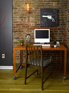
In today's world many people are working from home either for themselves or telecommuting for an employer. Working from home is a great endeavor, however, many don't have the room in their living space to have an actual office. 


One great solution to workspace issue would be to turn a closet into a work area that may or may not be closed off.   Keep in mind you'd be losing the closet.   In this case you're lucky if you have a larger closet so that you have a bit more area to spread out. 


Another great option is to partition the area off so that you don't have to view the work area when it's not used.  Again it becomes really great if you have a bit of extra room you can actually create a functional partition that would be used as part of the work station storage. 

Stairways create another great partition.  You're able to actually tuck the work area behind to hide it.
Disguising the desk is also can also create a unnoticeable workspace.  The desk can look like decorative furniture or art as shown above.
Of course you discover some unusual desk ideas that help create more space like this product from Kruikantoor.

Wednesday, May 16, 2012

THE EVOLUTION OF THE KITCHEN
  Have you ever been to a historic property and visited the area that they called a kitchen?  Nothing like what we have today, right?  In the 18th and early 19th century kitchens were typically located in an outbuilding next to a residence.  The reason for this was that the food odors would be kept out of the living area, the house would also be free of the intense heat of the cooking fire especially in the summer months, and that there would be no threat of a devastating fire to the residence.  In the latter part of the 19th century the wood burners turned to gas and began to be incorporated into building plans where a very small kitchen was part of the main house.  By the turn of the 20th century electricity was becoming a major part of every day life and electric stoves were eventually born along with ventilation to remove odors.  Kitchens were mostly utilitarian until about 1930 where kitchens can be found to have had added design details such as casual pendant lights, decorative knobs on the cabinets, and added wood detailing.  Casual eating areas also start to be found in kitchens in this era.

  In the 1950's kitchens really start to take on personal design styles.  The use of vibrant colors and many added decorative elements make the kitchen a fashion statement and the most important room in the home.  The microwave was also invented in this era, however, it was very expensive and rarely seen in a kitchen.

  1970's brought lots of patterns, decorative cabinet doors, and colored appliances.  Every aspect of a kitchen could match.

  In the 1980's - 90's islands and peninsulas became very popular to have in all kitchens.  Everyone wanted a place to sit directly next the kitchen.  Golden oak cabinets were the standard look seen at this time.  The invention of Corian revolutionized countertop material.  Granite was available, however, it was very expensive and didn't become a more common material until the late 90's.


   Since 2000 kitchen has become the main living area in the home that incorporates large casual dining spaces, sitting areas, wet bars and coffee stations.  The new kitchen is an open floorplan that has many work or relaxation stations for the everyday life of any given family. 
KAS INTERIORS, LLC - CLIENT KITCHEN

OPEN FLOORPLAN EXAMPLE COURTESY OF RESIDENTIAL ARCHITECT MAGAZINE

Thursday, March 1, 2012

Years of Oscars

Oscars 2012
Every year one lucky interior designer is chosen to create the interior in the Architectureal Digest's Green Room for the Oscar awards.  This year a California based designer named Waldo Fernanez was the chosen one.  This room is elegently designed in shades of gray with and eclectic collection of furniture that leans toward the Arte Deco style.  The horizontal lines of the walls and light curves of the furniture also reinforce this feeling.


Past years Green Room designs:

2011 - Room by Michael S. Smith

2010 - Room by Roger Thomas


2009 - Room by Stpehen Shadley

I for one am already excited to see next years room.


Thursday, December 8, 2011

Ideas for Lighting

Lighting is one of the most difficult areas of a home or office to get right. There are many considerations when dealing with proper lighting. The exact function of the room will dictate what type of lighting you will use and the locations for that lighting.


I have seen some very cool lighting ideas lately.


This wall sconce from Ameritec lighting comes in a large variety of finishes, however, the installation shown here is the most impressive. This sconce has been built into the wall so that it is invisible until lit.


The creation of LED lights has made it possible to light ANYTHING. These steps are terrazzo that incorporates the LEDs into the construction. On average LEDs last 100,000 hours which makes their possible uses infinate. The LEDs can also be seen in this Lumina panel by Sensitile.
My personal favorite and probably the most basic is the standard light strip LED. These light strips come in a multitude of sizes and can be used anywhere from under cabinets to lighting shelves. The smalles sizes are virtually impossible to see when installed correctly.
 
Lighting can add an effective look to any space and can also make or break any space which is why it is important to use it correctly.

Tuesday, October 4, 2011

So recently I was asked to vote on up in coming new designs for the interior design industry. Quite a few caught my interest. I'd like to share....


This wall material is a quartz surface made to look like natural onyx. It still allows light to pass through, however, it is not as fragile and will not stain like natural quartz. It is produced by the Seiffe Corporation


To the right you will see a super cool new wallpaper product by Weitzner. Yes, it's actually magnetic wallpaper. Imagine the places that you could use something like this.


A product to go hand in hand with the magnetic wallpaper could be this paint by Wolf Gordon. It allows you to transform virtually any surface into a dry erase board. How cool is that?!?!?!


Another product that I'm really excited about is the sheer fabric by Sacho. These are actually two silk net panels with plastic squares sewn in between. The effect is a transparent fabric with continually moving sheen of reflection. Elegant yet dynamic.


Finally, a truly fantastic way to combine tiles. This pattern by Artistic Tile is a mix of glass and stone. As you can see the stone is used as a two toned background and leaf pattern, while the glass is used as the flowers. This design combination allows for a additional dimension to the tile when you see the reflection of the glass. The glass also acts as focal point to direct your attention to the flowers. The effect is really quite beautiful.

Wednesday, September 28, 2011

Hello again!!!


You are now looking at the new improved blog for KAS Interiors. To start us off I've decided to show off some new cool products. Enjoy!


Is this where we're going? This kitchen totally hides all work stations by having a sliding countertop to cover plumbing and using fully integrated appliances.


Speaking of where we're going - look at where we've been! There's hardly any space to work due to all of the appliances. Of course the Pepto Bismol countertop is necessary in any kitchen.


A kitchen designed by a race car designer? Yes this is a design by Pininfarina. It looks fast! I wonder if it cooks fast too. It's definately HOT.


This is a full soaking tub. Beautifully designed to let the water completely embrace you as you soak. It does let the water overflow and recirculate.


Fun stuff, right?